
App-style bottom navigation bar design has quietly become one of the most reliable patterns on mobile websites. Users already know it from their phone’s native apps, it sits exactly where the thumb rests, and it removes the need to scroll back up to a hamburger menu. But a bar that looks great in a Dribbble shot often fails on a real device: too many icons, unreadable labels, content hidden behind the iPhone home indicator, or a navigation that screen readers cannot interpret.
This guide walks through the practical decisions: how many items to include, whether to pair icons with labels, how to respect thumb zones and iOS safe area insets, how to style active states, and the exact CSS and HTML to ship. Everything below is written for responsive websites, not native apps, so the code uses standard CSS with fixed positioning.
What Is a Bottom Navigation Bar?
A bottom navigation bar is a persistent horizontal bar anchored to the bottom of the viewport that gives direct access to the three to five most important destinations of a site or app. It is also called a bottom nav bar, tab bar (Apple’s name for it in iOS), or bottom app bar in Google’s Material Design vocabulary. On Android devices, the term can also refer to the system navigation bar with back, home and recents gestures, which is why it helps to say “bottom tab bar” when you talk with developers.
The key characteristic: it is for top-level navigation only. It is not a toolbar for contextual actions like share, delete or filter. Mixing destinations and actions in the same bar is the single most common cause of the usability problems designers run into.
When a Bottom Bar Beats a Hamburger Menu
- Your site has 3 to 5 clearly distinct sections that users switch between often (shop, search, cart, account).
- Sessions are long and involve back-and-forth movement between sections.
- You measure low engagement on hamburger menu items (a classic symptom of hidden navigation).
- Your traffic is mobile-heavy and conversion depends on a few key paths.
A bottom bar is not the right answer for content-heavy sites with deep hierarchies, editorial magazines with twenty categories, or brochure sites with four pages total. In those cases a top bar with a well-built menu still wins.
How Many Icons Should a Bottom Navigation Bar Have?
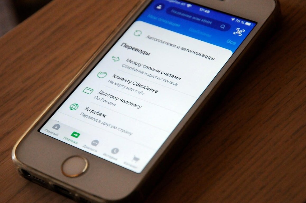
The short answer: three to five items, with four as the sweet spot. Below three, the bar wastes a full row of screen space. Above five, each tap target gets too narrow on a 360px wide device, labels truncate, and recognition speed drops.
| Number of items | Width per item on a 360px screen | Verdict |
|---|---|---|
| 2 | 180px | Use a segmented control or inline links instead |
| 3 | 120px | Great for focused apps and simple stores |
| 4 | 90px | Recommended default, labels fit comfortably |
| 5 | 72px | Maximum, labels must be one short word |
| 6+ | 60px or less | Avoid, mis-taps and truncation guaranteed |
If you genuinely need more than five destinations, the standard solution is a fifth item labelled “More” or “Menu” that opens a bottom sheet with the remaining links. Keep the overflow predictable: never reorder items dynamically, because users build muscle memory based on position.
Choosing Which Items Make the Cut
- Pull your top five mobile landing pages and top five exit paths from analytics.
- List the tasks that drive revenue (search, cart, booking, account).
- Keep Home as the first item on the left. It is the universal escape hatch.
- Put the highest-value action in the centre or right, where the thumb lands most naturally.
- Everything else goes into the page or into the “More” sheet.
Icons With Labels, or Icons Only?
Use icons with text labels. This is not a stylistic preference, it is an evidence-based default. Very few icons are universally understood: home, search, cart, heart and the person silhouette are recognised, almost everything else is not. Usability research has repeatedly shown that icon-only bars slow users down and increase error rates, and a hidden label also removes the easiest accessible name for assistive technology.
| Approach | Pros | Cons |
|---|---|---|
| Icon + label (recommended) | Unambiguous, better accessibility, larger perceived tap target | Needs 56 to 64px of height |
| Icon only | Compact, visually clean | Guesswork for the user, requires aria-label, poor for occasional visitors |
| Label only | Clear, easy to translate | Slower visual scanning, weaker brand feel |
| Label on active item only | Saves space, highlights current section | Layout shifts on tap, inactive items stay ambiguous |
Label writing rules: one word where possible, maximum twelve characters, sentence case, no truncation with ellipsis. If a label does not fit in your tightest supported language (German and Finnish are usually the stress test), rename the destination rather than shrinking the font below 10px.
Thumb Zones: Why the Bottom Wins
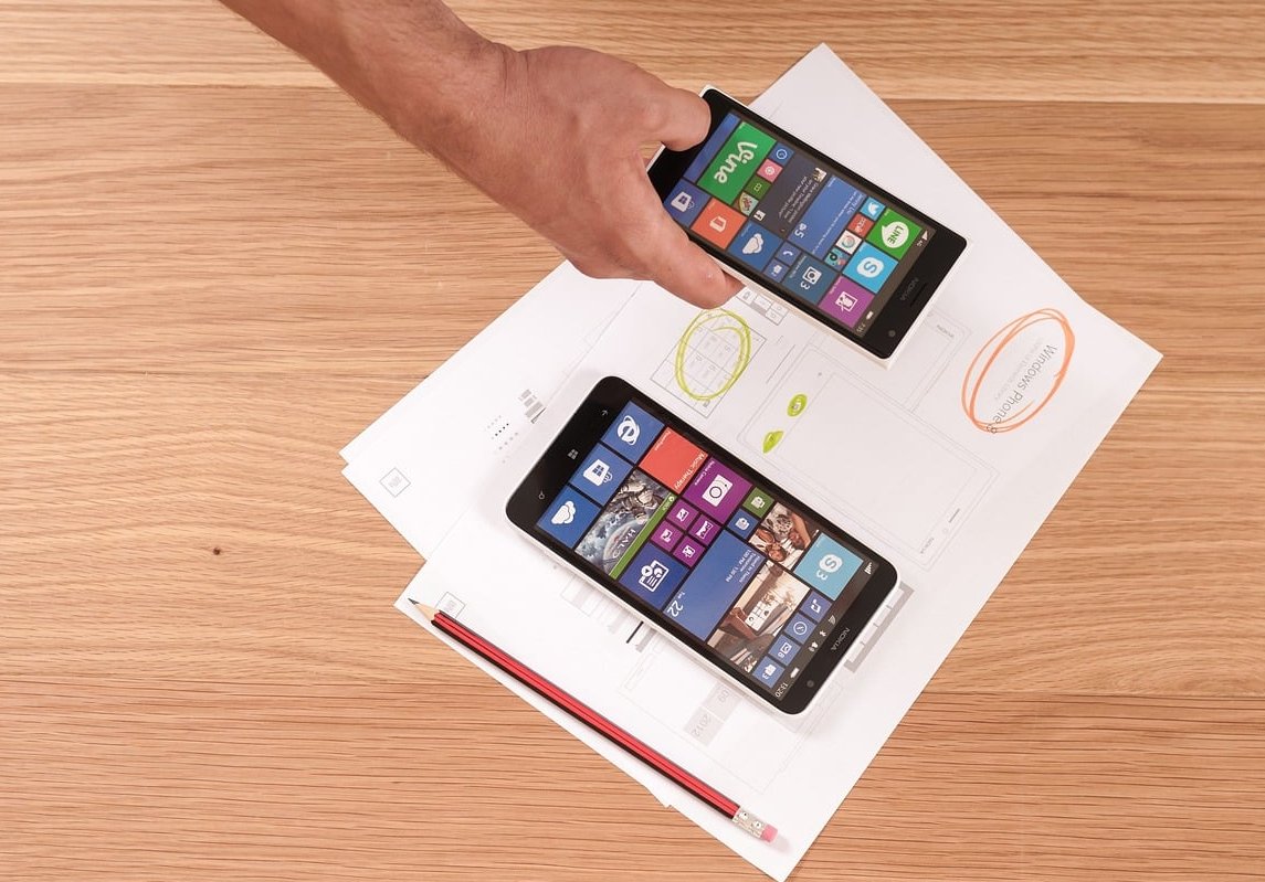
Hold a phone one-handed and the thumb sweeps a natural arc across the lower half of the screen. Screens have grown well past 6.5 inches, which makes the top corners effectively unreachable without a grip change. That is the whole argument for bottom navigation bar design.
| Screen area | Reachability | Put this here |
|---|---|---|
| Bottom third | Easy | Primary navigation, main CTA |
| Middle third | Comfortable | Content, secondary actions |
| Top third | Hard, requires regrip | Logo, branding, rarely used icons |
| Very bottom 20px | Conflicts with system gestures | Nothing tappable, reserve as safe area padding |
Tap Target Sizing
- Minimum touch target: 44 x 44 CSS pixels (Apple) or 48 x 48dp (Material). Use 48px as your floor.
- Bar height excluding safe area: 56px to 64px for icon plus label, 48px to 56px for icon only.
- Icon size: 24px, with optical weight adjusted so filled and outlined variants look equal.
- Label size: 10px to 12px, with a letter-spacing bump of about 0.01em for legibility.
- Keep at least 8px of horizontal breathing room between adjacent targets so a slightly off tap still lands correctly.
iOS Safe Area Insets: The Detail Everybody Forgets
On iPhones with a home indicator, the bottom 34 points of the screen belong to the system. A bar pinned with bottom: 0 will have its labels sitting under that indicator, and the swipe-up gesture will steal taps. The fix is the env() function combined with a viewport meta tag that allows the page to extend into the safe area.
<meta name="viewport" content="width=device-width, initial-scale=1, viewport-fit=cover">Without viewport-fit=cover, the env(safe-area-inset-bottom) value resolves to 0 and your padding does nothing. Then add the padding on the bar itself, not on an inner wrapper, so the bar’s background colour continues to the physical bottom edge of the screen.
The CSS: A Production-Ready Bottom Navigation Bar
HTML Structure
<nav class="bottom-nav" aria-label="Primary">
  <ul>
    <li>
      <a href="/" aria-current="page">
        <svg class="bottom-nav__icon" viewBox="0 0 24 24" aria-hidden="true" focusable="false"><path d="M3 11l9-8 9 8v10a1 1 0 0 1-1 1h-5v-7H9v7H4a1 1 0 0 1-1-1z"/></svg>
        <span class="bottom-nav__label">Home</span>
      </a>
    </li>
    <li>
      <a href="/search/">
        <svg class="bottom-nav__icon" viewBox="0 0 24 24" aria-hidden="true" focusable="false"><circle cx="11" cy="11" r="7"/><path d="M20 20l-3.5-3.5"/></svg>
        <span class="bottom-nav__label">Search</span>
      </a>
    </li>
    <li>
      <a href="/cart/">
        <svg class="bottom-nav__icon" viewBox="0 0 24 24" aria-hidden="true" focusable="false"><path d="M6 6h15l-1.5 9h-12z"/></svg>
        <span class="bottom-nav__label">Cart</span>
        <span class="bottom-nav__badge">3<span class="sr-only"> items in cart</span></span>
      </a>
    </li>
    <li>
      <a href="/account/">
        <svg class="bottom-nav__icon" viewBox="0 0 24 24" aria-hidden="true" focusable="false"><circle cx="12" cy="8" r="4"/><path d="M4 21c0-4 3.6-6 8-6s8 2 8 6"/></svg>
        <span class="bottom-nav__label">Account</span>
      </a>
    </li>
  </ul>
</nav>
Core Styles
:root {
  --bottom-nav-height: 58px;
  --bottom-nav-accent: #c2410c;
  --bottom-nav-muted: #64748b;
}

.bottom-nav {
  position: fixed;
  left: 0;
  right: 0;
  bottom: 0;
  z-index: 60;
  background: #ffffff;
  border-top: 1px solid #e2e8f0;
  padding-bottom: env(safe-area-inset-bottom, 0px);
  box-shadow: 0 -1px 12px rgba(15, 23, 42, 0.06);
}

.bottom-nav ul {
  display: flex;
  margin: 0;
  padding: 0;
  list-style: none;
}

.bottom-nav li { flex: 1 1 0; }

.bottom-nav a {
  position: relative;
  display: flex;
  flex-direction: column;
  align-items: center;
  justify-content: center;
  gap: 4px;
  min-height: var(--bottom-nav-height);
  padding: 6px 4px;
  text-decoration: none;
  color: var(--bottom-nav-muted);
  font-size: 11px;
  line-height: 1.2;
  -webkit-tap-highlight-color: transparent;
}

.bottom-nav__icon {
  width: 24px;
  height: 24px;
  fill: none;
  stroke: currentColor;
  stroke-width: 1.8;
  stroke-linecap: round;
  stroke-linejoin: round;
}

/* Active state */
.bottom-nav a[aria-current="page"] {
  color: var(--bottom-nav-accent);
  font-weight: 600;
}

.bottom-nav a[aria-current="page"]::before {
  content: "";
  position: absolute;
  top: 0;
  left: 50%;
  transform: translateX(-50%);
  width: 28px;
  height: 3px;
  border-radius: 0 0 3px 3px;
  background: var(--bottom-nav-accent);
}

.bottom-nav a:focus-visible {
  outline: 2px solid var(--bottom-nav-accent);
  outline-offset: -3px;
  border-radius: 10px;
}

/* Stop the bar from covering page content */
body {
  padding-bottom: calc(var(--bottom-nav-height) + env(safe-area-inset-bottom, 0px));
}

/* Desktop: hand navigation back to the header */
@media (min-width: 768px) {
  .bottom-nav { display: none; }
  body { padding-bottom: 0; }
}
Badges and Counters
.bottom-nav__badge {
  position: absolute;
  top: 4px;
  left: 55%;
  min-width: 18px;
  padding: 0 5px;
  border-radius: 9px;
  background: #dc2626;
  color: #fff;
  font-size: 10px;
  font-weight: 700;
  line-height: 18px;
  text-align: center;
}

.sr-only {
  position: absolute;
  width: 1px;
  height: 1px;
  padding: 0;
  margin: -1px;
  overflow: hidden;
  clip: rect(0 0 0 0);
  white-space: nowrap;
  border: 0;
}
Optional: Hide on Scroll Down, Show on Scroll Up
Only do this if vertical space is genuinely tight, for example on long article pages. Persistent is better for e-commerce.
.bottom-nav {
  transition: transform 0.22s ease;
  will-change: transform;
}
.bottom-nav.is-hidden {
  transform: translateY(100%);
}
@media (prefers-reduced-motion: reduce) {
  .bottom-nav { transition: none; }
}
let lastY = window.scrollY;
const bar = document.querySelector('.bottom-nav');
window.addEventListener('scroll', () => {
const y = window.scrollY;
if (Math.abs(y - lastY) < 8) return;
bar.classList.toggle('is-hidden', y > lastY && y > 120);
lastY = y;
}, { passive: true });
Active State Design
The current section must be obvious at a glance, and the indicator must never rely on colour alone. Combine at least two of the following signals:
- Colour change on icon and label, with a contrast ratio of at least 3:1 against the bar background for the icon and 4.5:1 for the label text.
- Icon weight swap, outlined when inactive and filled when active. This is the cleanest signal and works for colour-blind users.
- Top indicator line or pill background behind the active item.
- Bolder label weight, but watch out for layout shift: reserve the bold width in advance or use a font with matching metrics.
Avoid these: animating the active item so it jumps above the bar (it breaks the alignment grid and can collide with system gestures), enlarging the active icon by more than 10 percent, and using a raised centre button for a destination. A raised centre floating button should be an action such as “Add” or “Scan”, not a page.
Accessibility and Screen Readers
A bottom bar is navigation, so build it as navigation. The checklist below covers what audits usually flag:
- Wrap the bar in
<nav aria-label="Primary">. If the page has more than one nav landmark, every one needs a unique label. - Use a
<ul>so screen readers announce “list, 4 items” and users know how many destinations exist. - Use real
<a href>links, not<div>with a click handler. Links are focusable, work with swipe gestures in VoiceOver and TalkBack, and support open in new tab. - Mark the current destination with
aria-current="page". Screen readers announce “current page” and you get a free CSS hook. - Set
aria-hidden="true"andfocusable="false"on decorative SVG icons so the label is not read twice. - If you ship an icon-only bar, give every link an
aria-label, and remember that this helps screen reader users but not sighted users who do not recognise the glyph. - Announce badge values in words, for example a visually hidden “3 items in cart”, rather than leaving a bare number.
- Keep a visible
:focus-visiblering for keyboard and switch-control users. - Place the nav element near the end of the DOM so screen reader users reach the main content first, and provide a skip link at the top of the page.
- Respect
prefers-reduced-motionfor any transition, and test with iOS Zoom and 200 percent text size.

Common Mistakes to Avoid
| Mistake | Fix |
|---|---|
| Bar covers the last paragraph or the footer | Add bottom padding to body equal to bar height plus safe area inset |
| Bar floats over the on-screen keyboard | Hide it on input focus, or use the VirtualKeyboard API / dvh units |
| Two sticky bars (cookie banner plus nav) | Stack z-index deliberately and dismiss the banner before showing the nav |
| Sticky “Add to cart” button fighting the nav | Place the product CTA directly above the nav, never overlapping |
| Destinations and actions mixed in one bar | Move actions into the page or into a floating action button |
| Items that change order per page | Keep the set and order identical sitewide |
| Transparent bar over scrolling content | Use a solid background or backdrop-filter with a fallback colour |
Testing Checklist Before You Ship
- Test on a real iPhone with a home indicator and on an Android device with gesture navigation.
- Rotate to landscape and confirm the bar does not eat more than a reasonable slice of the viewport.
- Open a form and check the bar behaviour when the keyboard appears.
- Set the system font size to maximum and verify that labels do not overlap.
- Run a VoiceOver and TalkBack pass through all items.
- Check colour contrast for both active and inactive states, including dark mode.
- Verify that the bar disappears cleanly at your desktop breakpoint and that no layout padding is left behind.
- Watch Core Web Vitals: a fixed element must not cause layout shift on load, so render it server side rather than injecting it with JavaScript.
FAQ
What is the bottom navigation bar called?
It goes by several names: bottom navigation bar, bottom nav bar, tab bar (iOS terminology), bottom app bar (Material Design), or simply mobile tab navigation. On Android, “navigation bar” can also mean the system bar with the back, home and recents controls, so be specific when briefing a developer.
How many items should a bottom navigation bar have?
Three to five. Four is the best balance between coverage and tap target width. If you need more destinations, add a “More” item that opens a bottom sheet instead of squeezing six or seven icons into the bar.
Should the bottom bar always be visible?
For e-commerce, marketplaces and dashboards, keep it persistent. For long-form reading, you can hide it on scroll down and bring it back on scroll up. Always bring it back instantly when the user scrolls up, and never hide it behind a gesture users cannot discover.
How do I stop the bottom bar from hiding my content?
Add padding-bottom: calc(var(--bottom-nav-height) + env(safe-area-inset-bottom, 0px)); to the body or to your main content wrapper. The env() value only works if your viewport meta tag includes viewport-fit=cover.
Does a bottom navigation bar hurt SEO?
No, as long as the items are real crawlable links in the HTML and the bar is rendered without blocking content. In fact, consistent internal linking to your key sections helps. The risks are technical: layout shift from late injection, or duplicating the same link set in a way that pushes main content far down the DOM. Place the nav markup near the end of the body and position it visually with CSS.
Should I use a bottom navigation bar on desktop?
No. On desktop the cursor reaches anywhere instantly and screen width is plentiful, so a top header with full navigation is better. Hide the bottom bar at your tablet or desktop breakpoint and remove the compensating body padding at the same time.
Can I add a raised centre button?
Yes, but reserve it for a single high-value action such as “Sell”, “Post” or “Scan”, not for a navigation destination. Keep the raised button at least 56px wide, give it a clear accessible name, and make sure it does not sit inside the system gesture area at the very bottom of the screen.
Final Thoughts
Good bottom navigation bar design is mostly restraint: four destinations, clear icons paired with short labels, a 48px minimum tap target, honest active states, and proper safe area padding so nothing hides behind the home indicator. Ship it as semantic HTML with real links and aria-current, test it on a physical phone, and it will quietly lift engagement across every mobile session.
If you want a mobile experience built on these foundations from day one, the team at FatCow Web Design designs and codes responsive websites with accessibility and performance baked in. Get in touch and we will audit your current mobile navigation for free.
